
A few charts for you
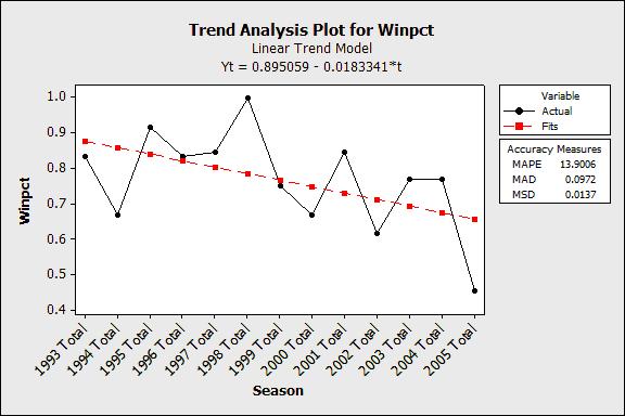
I’ve updated two graphs to share with you. The first graph illustrates the winning percentage for the 13 full seasons of CPF’s tenure as head coach via a trend analysis. I won’t get all geeky with you, but the red line is the trend and it is not going in the right direction.
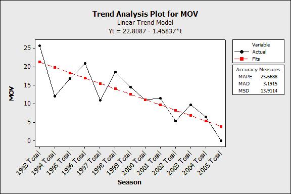
The second graph is more damning of the program. This indicates the average margin of victory via trend analysis over the 13 years of CPF. Things sure started off great, but the only place to go from here is negative territory. With the sisters of the poor at the end of our schedule, this is inexcusable. Of course, so is losing to one of the sisters.
Click here to discuss this in the Outer MonVOLia Forums
The second graph is more damning of the program. This indicates the average margin of victory via trend analysis over the 13 years of CPF. Things sure started off great, but the only place to go from here is negative territory. With the sisters of the poor at the end of our schedule, this is inexcusable. Of course, so is losing to one of the sisters.
© www.OuterMonVOLia.com 2005
Click here to discuss this in the Outer MonVOLia Forums
posted by Mattdaddy at 4:48 AM
![]()
![]()

1 Comments:
The evidence you present on the rapid decline of the University of Tennessee football program is incriminating. What would the average "joe blow" football fan think if they had such information in front of them? Hell, what would Mike Hamilton say if this were presented to him in front of a panel of peers?
Post a Comment
<< Home